So, what are the top 10 ‘must-haves’ for a website?
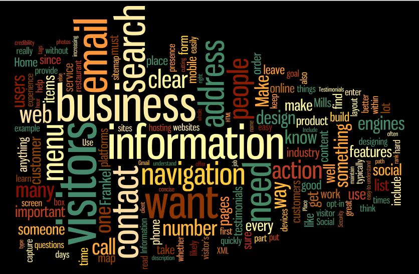
A quick google search found many such lists to review and digest. I decided to have a little fun and loaded all the content from three different pages (mashable.com, susangreenecopywriter.com, and ladytechtamer.com) into a word mapping program.
On a slight tangent discussion, I really love these word mapping tools; they give you a “different look” at just what your content is telling visitors. They give a visual representation of what words are repeated the most and which seem to hold the highest priority in the content. You can use the tools to review someone’s resume, your own webpage, or your own LinkedIn profile to see just what message is being sent. You can also tweak the output by ignoring specific words.
In my example I removed words that don’t add to the overall value of the content, such as website, site, and page.
In my exercise, the top 10 words that stand out are listed below. You can also see the rankings in wordle.net via the Language>Show Word Counts and sort it by ‘frequency’: visitors, business, information, email, search, need, contact, address, navigation, and action.
So what does this tell you about the ‘must-haves’ on your website? Here are a few quick comments on each element.
- Visitors — Your website’s sole purpose should be to appeal to its visitors. You can talk about you or your company, but only as it relates to your visitors. Why would they care? Make sure you ask customers what they like and/or dislike about your site.
- Business — What business are you in, and what can you do for the visitors?
- Information — People come to your site for information about your business and your customers (previous visitors). Giving facts on success stories from a customer’s(visitor) point of view helps lead to your success as well.
- Email — Make it easy for them to contact you, like through a ‘more info’ request form on your site. Remember to require their email addresses so you can contact them.
- Search — So they got to your site somehow and now they are looking for widget X or a story about Y. Make it easy for them to find it through a search feature that covers your entire website.
- Need — A funny word amongst the rest of these, until you remember that visitors come to your site because they need something. Make it easy for them to find it and read stories about how you helped other visitors fulfill their needs.
- Contact — Similar to email – make it easy for them to contact you. Keep your phone, location(s) and “contact us” button highly visible.
- Address — See # 7
- Navigation — I’m surprised this one isn’t more important, but I guess being part of the top 10 is what matters. If navigating through your site doesn’t make sense and is difficult, visitors will leave before they find what they need.
- Action — Your main goal behind a website is to encourage an interaction between the visitor and your company. Give them an action to take (call-to-action) to make that interaction worth something to them.


