 From development work to design strategy, we design websites with the user experience in mind. Every day, our team of developers and strategists and designers makes decisions pertaining to website design, both our own and that of our clients. But what goes on behind every decision? What do we take into account? How are our decisions, specifically our design ones, made?
Before we get into our design mindset, it’s important we talk about web design ethics. That last word can mean everything and nothing all at once, and if it’s not defined properly, things tend to get blurred, meaning things tend to become unethical. For the purpose of this blog, we’ll use Smashing Magazine’s definition of ethical design:
“Ethics will be defined as a system of moral principles that defines what is perceived as good and evil. Ethical design is, therefore, design made with the intent to do good, and unethical design is its black hat counterpart.”
So, as designers, it is our job to create products that are good quality, that do good, and that are good for the people using them. Sometimes it can be difficult to design what others want because perhaps what they want isn’t as ethical as it could or should be. This is where we strive to make sure web design ethics are taken into consideration every step of the way.
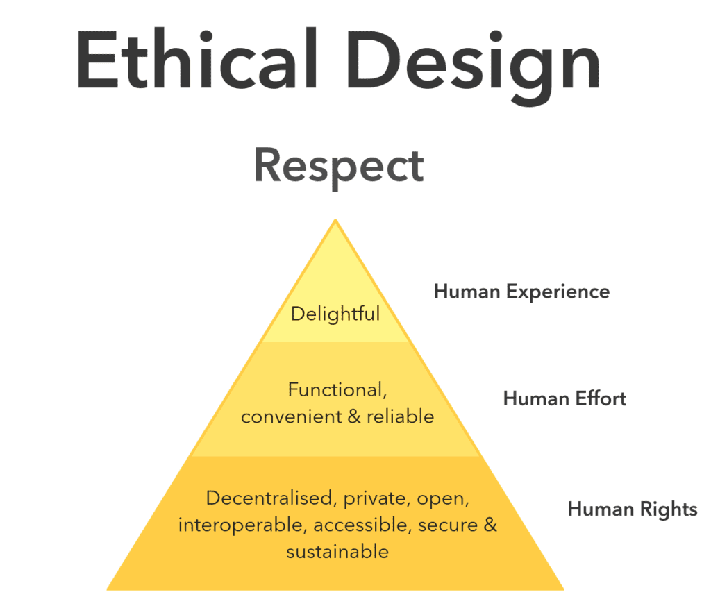 At the general level, we can look to this Ethical Hierarchy of Needs created by Ind.ie, which is a not-for-profit striving for social justice in the digital age. We wholeheartedly agree with them that ethical design is all about respect. We need to make sure the websites we’re designing respect human rights, human effort, and human experience. If something we design does not respect just one of those three needs, then we’ve designed something unethical.
At this point, you might be wondering–what exactly can be unethical in web design?
We’ll give you one example that’s arguably the most problematic in today’s world: dark patterns. Dark Patterns are tricks used in websites and apps that make you buy or sign up for things that you didn’t mean to. There are plenty of examples of this throughout the World Wide Web. And there are ones you’ve definitely encountered before.
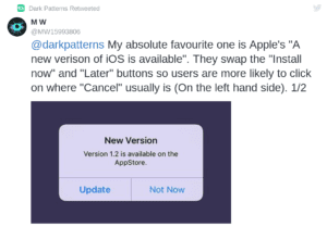 For instance, Apple switches their action buttons when they want you to download their new update. But maybe you don’t have time to do that, yet you mistakenly click as a force of habit on the wrong button. You’re then stuck with downloading their upgrade. This is what a Dark Pattern is. You can go to DP’s Hall of Shame, and scroll through more examples. When you see them once, you’ll begin to see them everywhere.
Now, let’s get back to those questions we mentioned at the beginning.
At the Buckeye Interactive level, we design to solve problems, and we keep our core values in mind–ingenuity, initiative, and collaboration.
These values guide not only the decisions we make but also the work we create. We practice ingenuity in order to ensure we’re coming up with the best solutions out there, ones that are ethical, that promote good, and that benefit the user. We take initiative in order to ensure we’re embracing challenges, and we’re stepping up to solve problems, even ones that might be uncomfortable or daunting. And finally, we collaborate to ensure we hear multiple voices and different perspective in order to practice diversity and promote respect.
Designing while keeping ethics in mind is the road often not taken. It’s sometimes inconvenient, slow, and doesn’t generate as much revenue. But we must not forget why we design in the first place–we design to make good, do good, and be good. Ethics usually embodies and boils down to these two words, good and bad. Web design ethics should embody and boil down to only one word: good.
Let that word resonate in every single thing you design, no matter how small. That’s the only real way to influence change and respect. If you’d like an ethics checklist, you can refer to “The Ethical Principles of Web Design,” created by Smashing Magazine. As always, comment with any thoughts or questions. Contact us with any queries. And keep designing, creating, inspiring, and evolving.
